
Project
Orby TV Website Redesign
Orby TV offers a full package TV alternative for those looking to cut the cord with traditional cable companies. To educate shoppers about the service and drive conversions, they needed to update their website design and improve the user experience.
Orby TV aims to offer a full package TV alternative for those looking to cut the cord with traditional cable companies. To educate shoppers about the service and drive conversions, they needed to update their website design and improve the user experience.
The Challenge
Rounds of previous user research showed that Orby TV website visitors weren't totally connecting with the value of the service. Some of the key issues identified were:
Outdated site design, not resonating with the audience
Poor conversion rate
Limited online purchase & installation scheduling features
Important information sometimes hard to find
Negative reaction to high upfront costs
My Role
I was hired by Multiplica, a digital design agency, to help with multiple design projects for Orby TV, creating responsive web experiences, conducting user research, and building prototypes for new designs.

The projects I worked on were involved creating totally new designs and also building off of existing material provided by Orby TV's internal design team.
Audience Insights
For consideration in design, we had some high-level info about the customer base:
Seeking traditional cable experience without the traditional cable bill
Age demographic skews older
Price sensitive
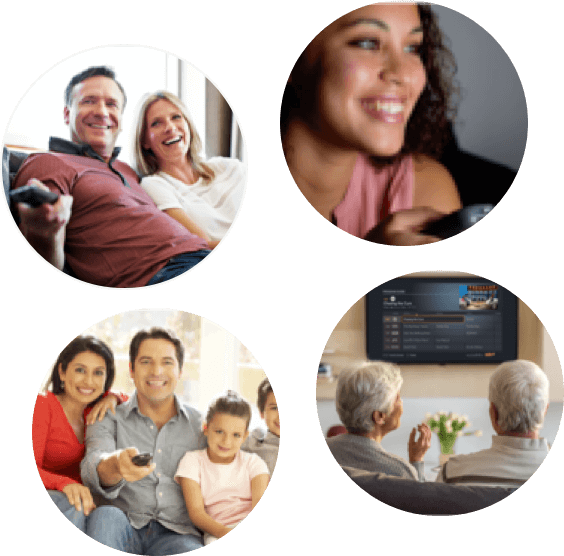
These insights helped me empathize and design with a focus on optimal readability, usability, and surfacing product benefits in a way that put Orby TV's service on par with big name TV providers, while highlighting the significant cost savings.
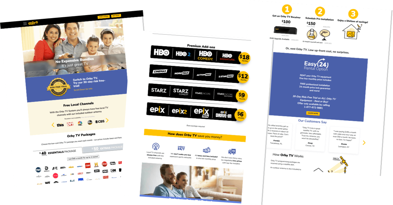
Homepage Design
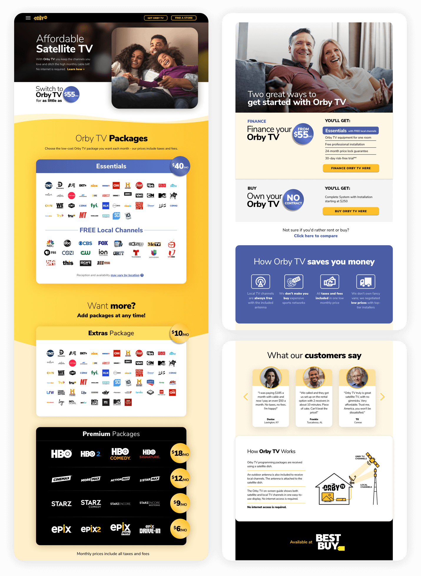
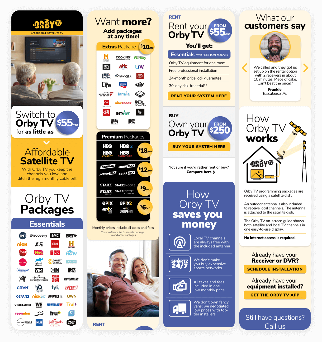
Preliminary mobile-version designs for the updated homepage and other various screens had previously been drafted by Orby TV's internal designer.
My role in the homepage redesign was to update visual content and translate the mobile designs into a desktop experience.
Purchase & Installation Flows
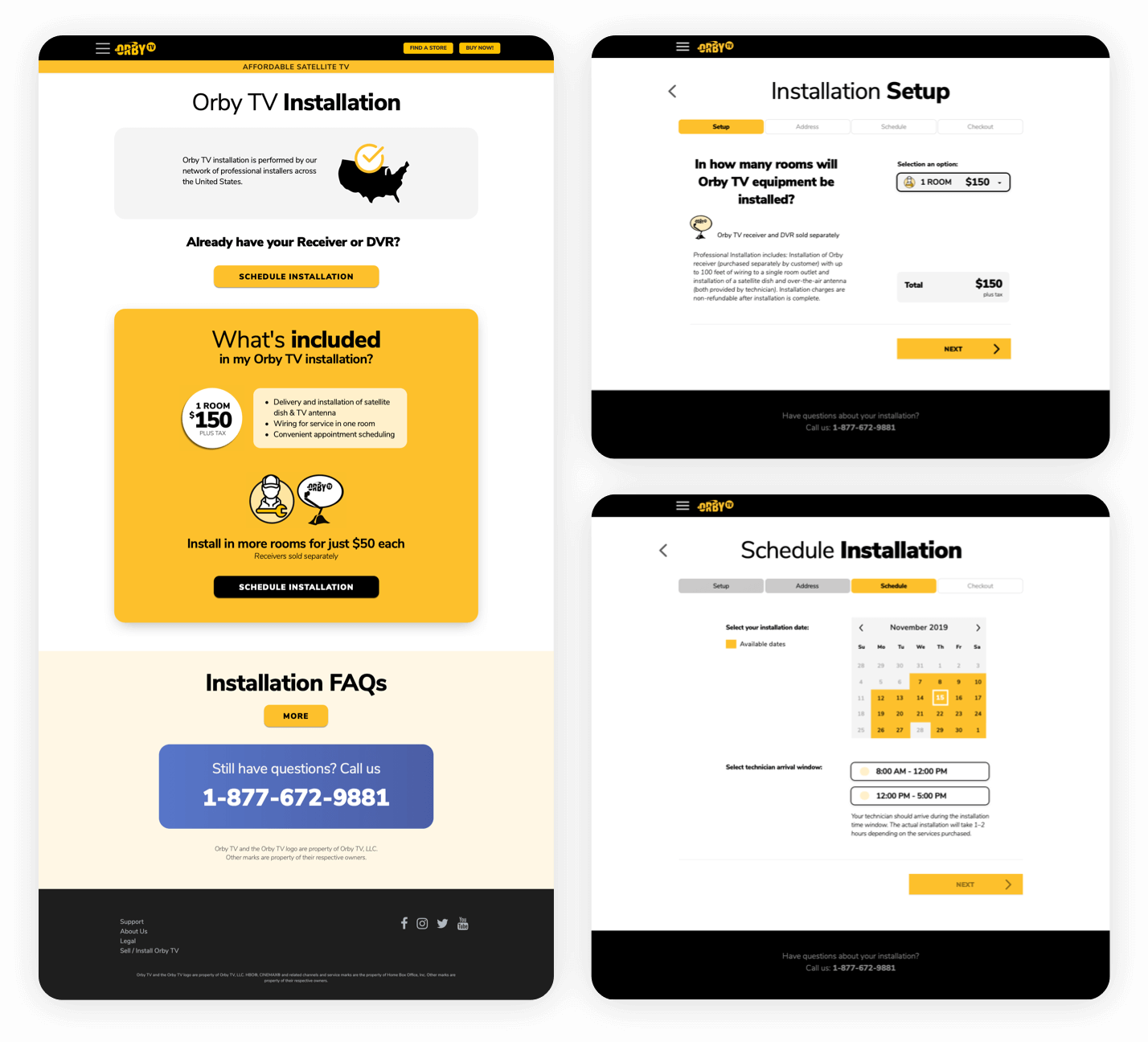
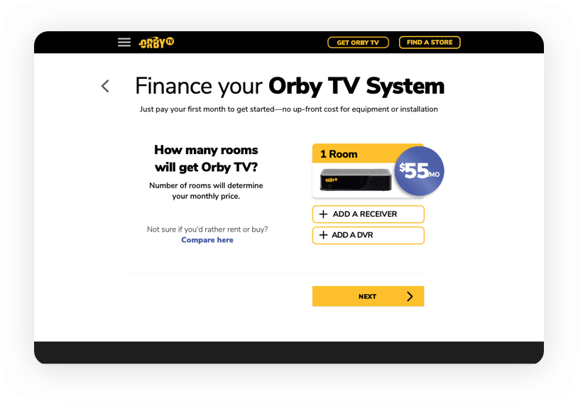
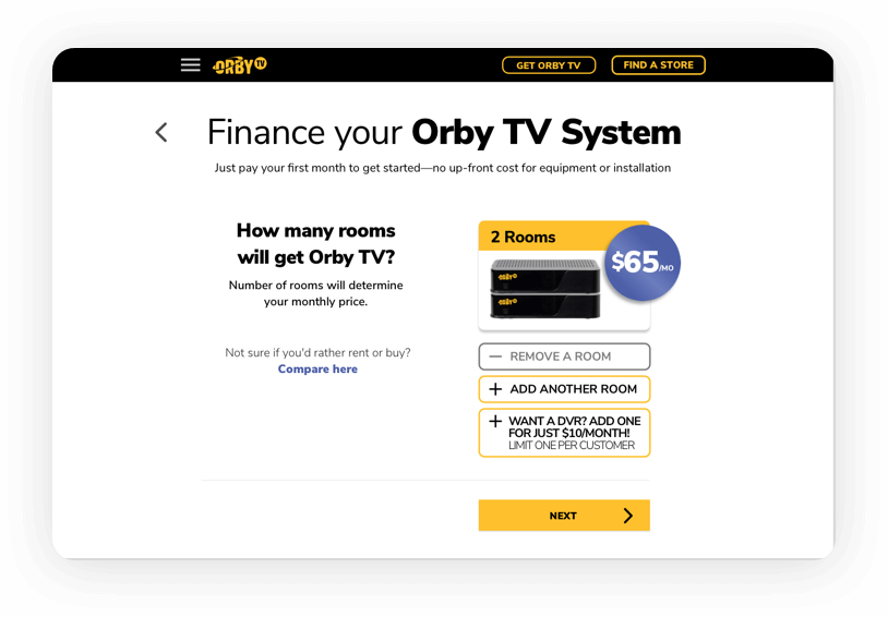
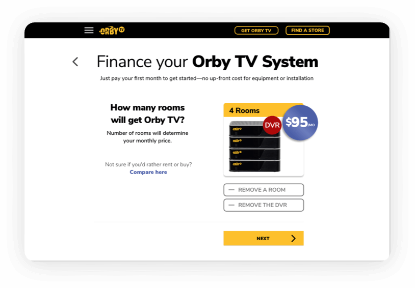
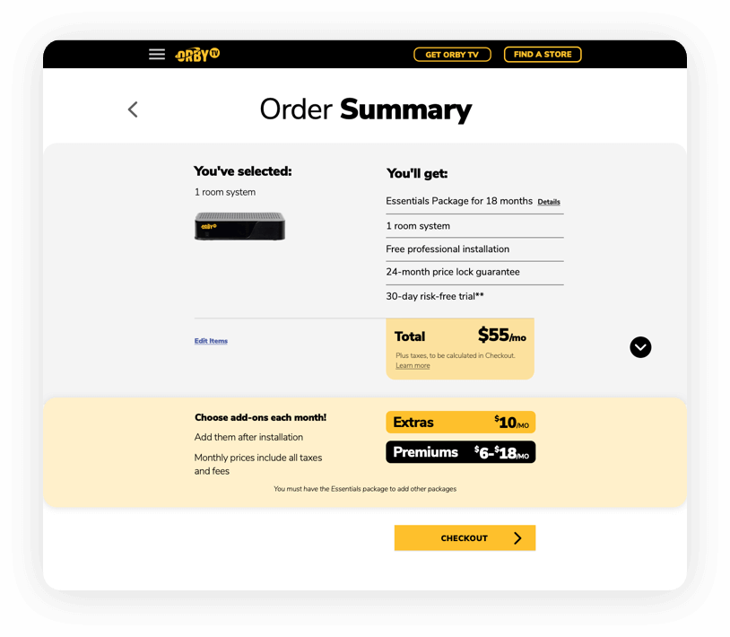
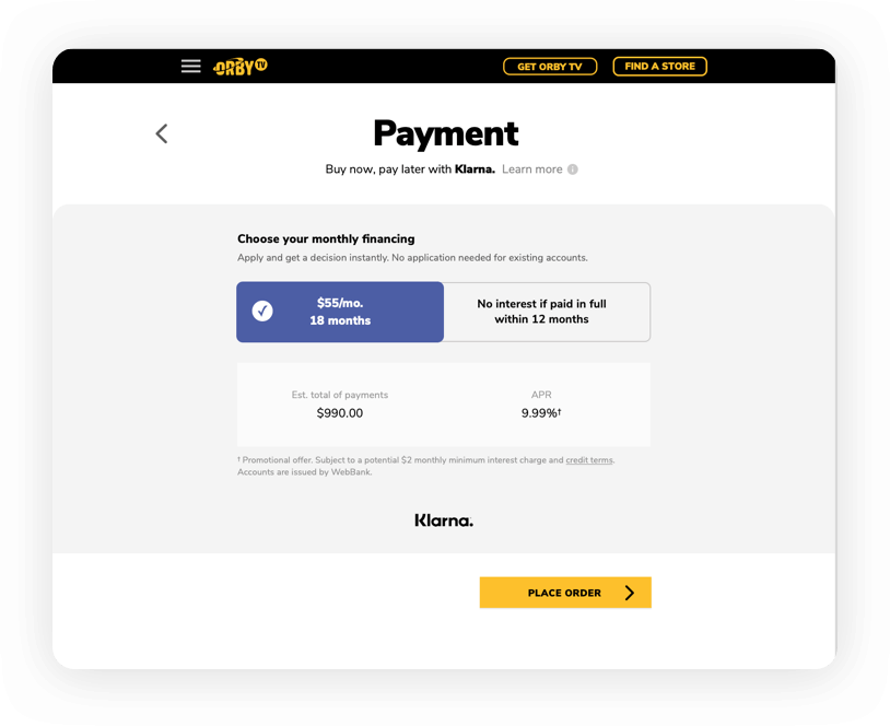
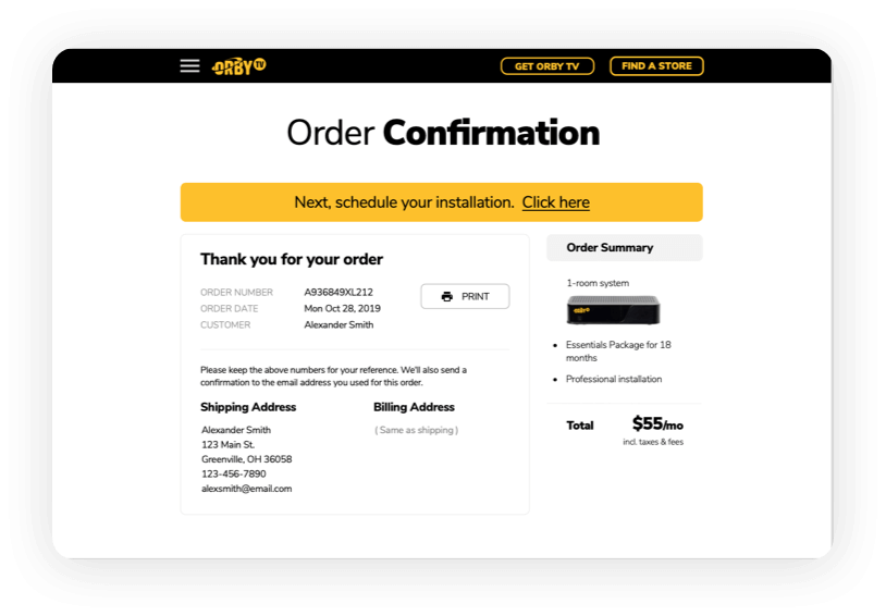
A key missing element from the Orby TV website was an online service and installation ordering system. For this part of the project, the client outlined requirements for the flow and provided some draft mobile designs of select screens. I designed final screens for each step of the flow and built prototypes for the desktop experience.
With the audience in mind, these designs feature large and easy to read text, simple interactions, clearly labeled buttons, and easy to locate nav elements.
Prototyping
To demonstrate the full experience to the client and test with users, I built a prototype in Marvel app.
Store Locator
Customers can purchase Orby TV service either on the website or at Best Buy, their retail partner. I was tasked with designing a store locator for the Buy-In-Store option.
Since store locators are ubiquitous, I followed common usability patterns for this feature including location cards and a simple map view, with buttons for quick access from the website to navigational apps.
The Results
As a followup to the design efforts, I was also tasked with conducting user research to measure the effectiveness of these design updates and see how potential customers respond to Orby TV's offer.
User Testing Process
Write test script
I started by writing a short, three-task script doable in 20-30 minutes that introduced Orby TV, described tasks, and included verbal response questionnaires.
Administer test
Tests were administered through TryMyUI online testing platform, which captured voice and video of each tester's experience.
Analyze tester sessions
I documented tester feedback and behavioral patterns to uncover new insights into the user experience.
Present findings
Analysis, insights, and proposed solutions were compiled into a presentation deck for the client to review.
Learnings & Feedback
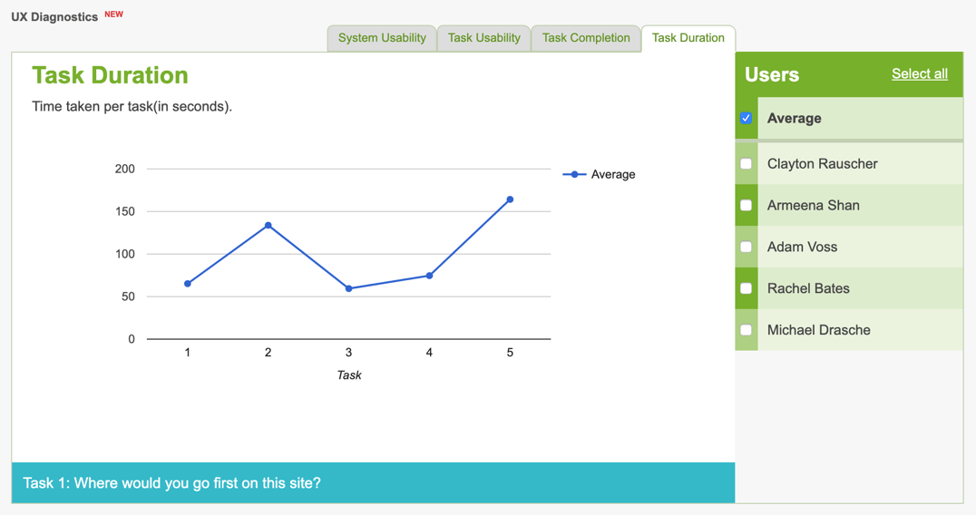
User testing revealed there were still mixed feelings about startup costs and comparative value of the service, yet testers overall reported finding the site easy to use, simple to navigate, and expressed a clear understanding of Orby TV's offering:
It was easy to navigate."

