Project
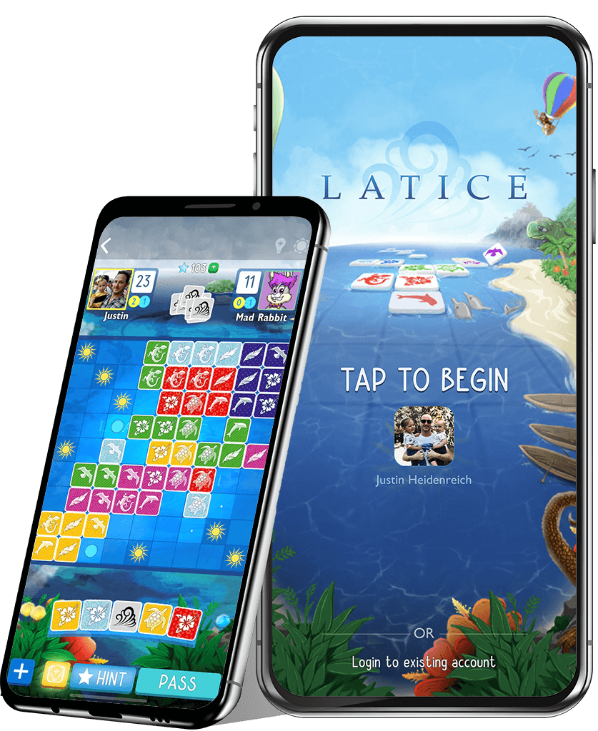
Latice Mobile Game App
The Latice Mobile Game App is based on the multi-award winning Latice board game designed and published by Adacio, a California-based startup gaming company.
As a founding member of the Adacio team, I had an opportunity to play a large role in strategic design, execution, and marketing of both the physical board game and app, all the way from product conception through to market and beyond.
The Challenge
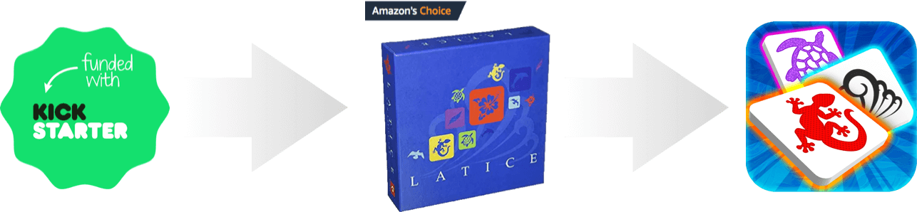
Initially Kickstarted as a tabletop board game in 2015, annual sales for Latice on Amazon grew strong (50,000+ copies/yr). The game quickly developed a passionate, loyal fanbase (including ourselves!).
Our challenge was to adapt the physical game to a digital format and drive new growth for the game and company. To pursue this goal, we took a measured, data informed approach that prioritized the user experience to create long term player engagement.
My Role
THE ADACIO TEAM


I worked on the Latice mobile game app between 2015 - 2019. I wore many hats at Adacio, but my primary role as Lead Designer typically involved:
Designing new flows and interfaces
Analyzing player behavior and feedback for new insights
Creative concepting and art direction for graphic artists and illustrators
Front-end development of interfaces, animations and interactions in Unity
In the Beginning
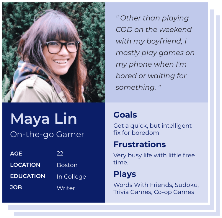
Defining the Audience
Early on, we realized that the mobile version of Latice might have a slightly different audience than the tabletop version of the game, so we started at square one - defining our target audience.
Likely to play both mobile (casual) and more competitive console games
18 - 35 years old (Millenials)
Less time for gaming than in the past
Engagements are short, but frequent (might play a turn while standing in line at Starbucks)
Competitor Analysis
To best design for this audience and learn how top-performing mobile game brands build long term engagment, we thoroughly researched top-rated games on the App Store. What fun! We found these games all shared several key characteristics which served as guiding principles when the Latice app.


Broad appeal, playable by anyone at any age
Minimal hardware requirements
Easy to learn, hard to master
Meaningful gameplay within just a few seconds time
Launch & Learn (MVP)
Thanks to the Kickstarter, we had a solid mailing list of potential play testers to collect feedback from. The only thing we needed was an MVP to ship out! We set out to quickly building an initial browser-based version of the app with essential features including account setup/login, a home screen, and a gameplay screen - of course.
What We Learned
We learned from the MVP launch that designing and building the app to adaptively display in both landscape and portrait mode wasn't going to be worth it. Moving forward, we cut the landscape view to focus solely on optimizing for portrait display, saving untold amounts of future design and development time.
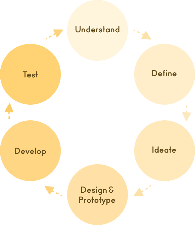
Design Process
After the initial beta launch, we began the process of building out the app into a more fully featured product in preparation for launch on the App Store.
Making measured progress toward our goals meant using an Agile workflow with an iterative design/development process. Design sprints were set in alignment with business goals at each step.
With help from user testing tools and Google Analytics, we could qualitatively and quantitatively measure design success of any feature and track progress toward our high level funnel KPIs.
Which Problems to Solve?
Sprints typically began with referencing analytics, user session recordings, and reflecting on progress toward goals. This data informed our decisions about which KPIs to target and impact with design for that sprint.
Increase engagement & retention
Improve onboarding completion
More social shares
Increase in-app purchases
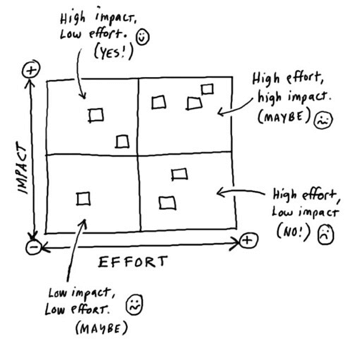
After brainstorming a list of suggested solutions, project priorities for the sprint were determined by which design solutions would provide the greatest impact toward our target KPIs with the least amount of effort.
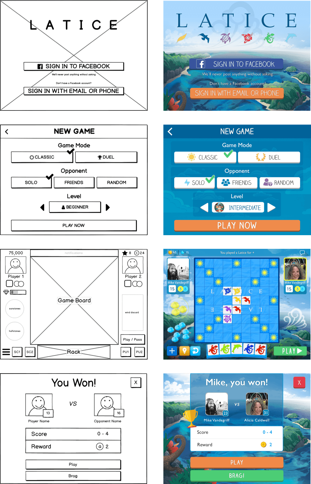
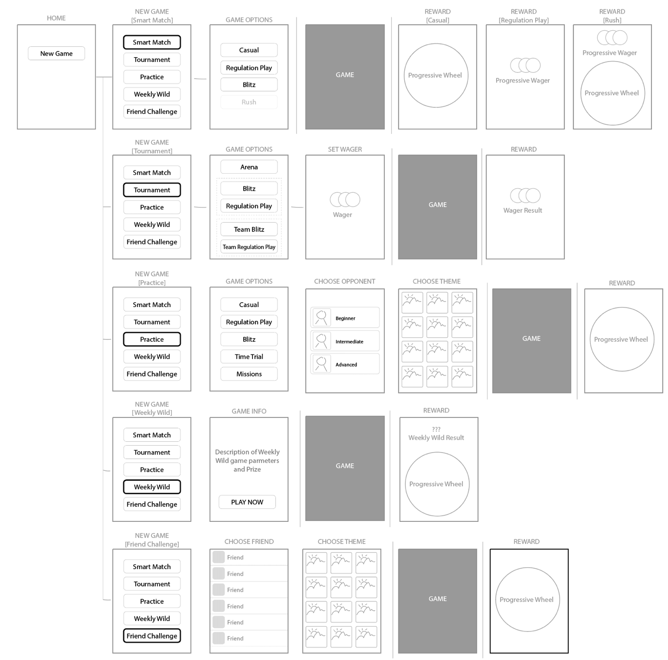
Wireframes & Flows
Once design goals were determined for the sprint, the first step was typically to wireframe the layout and user flow of any new design solution. Wireframes provide a light-weight way to quickly draft ideas, get feedback, and think through the experience from a user's standpoint.
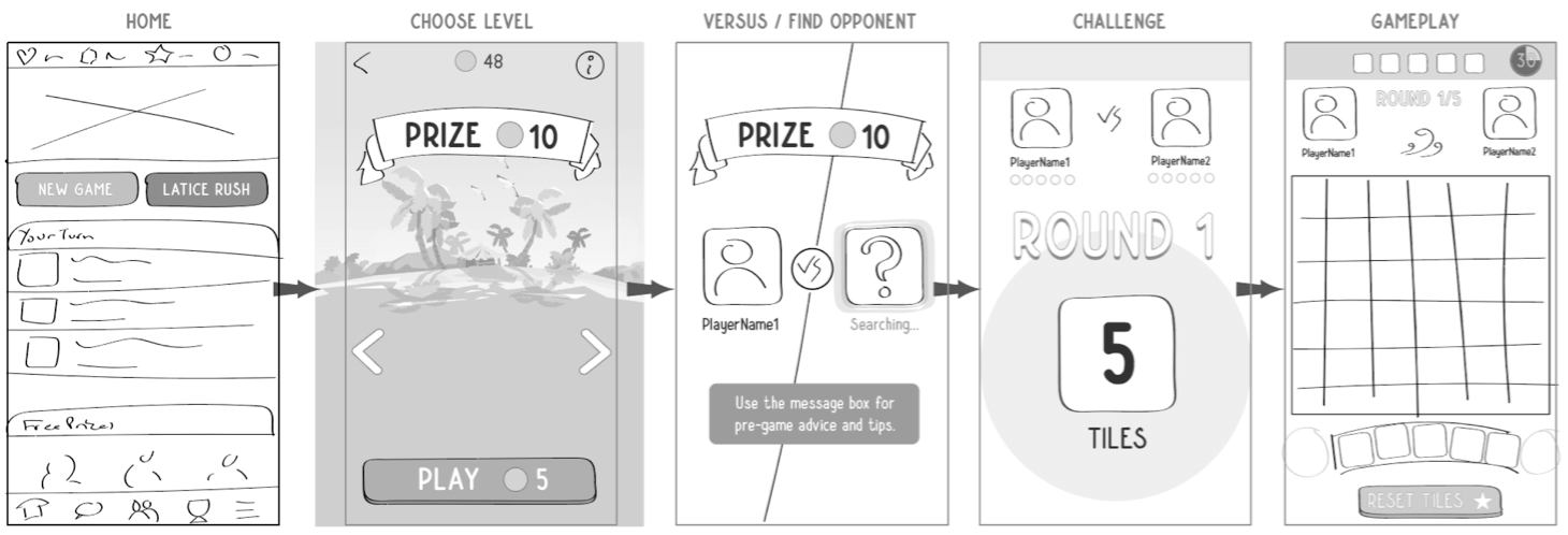
Visual Design & Prototyping
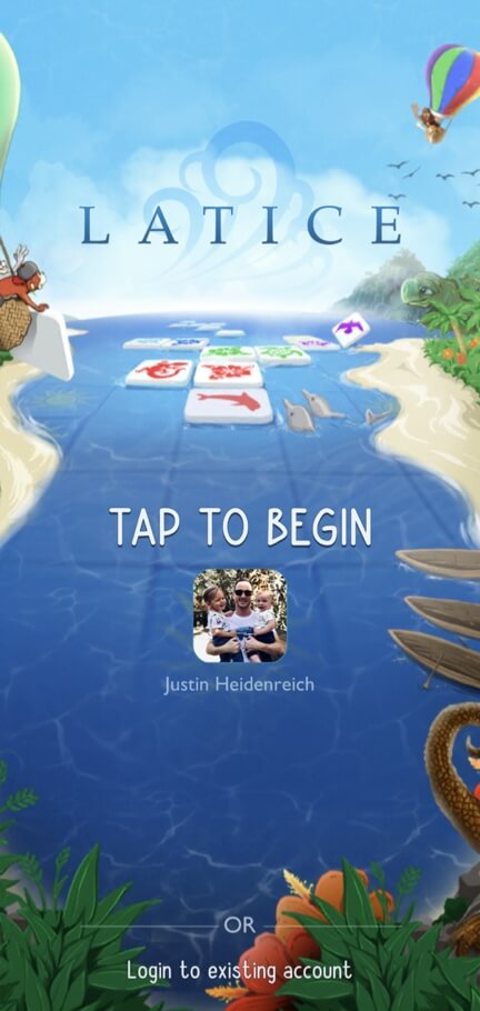
After establishing a rough layout and flow through wireframes, I'd create the full visual design for each screen. Although style for the app was rooted in the design of the physical Latice game, we aimed to create a stronger sense of playfulness with typography and color palette choices for the app.
Typography / Primary

Typography / Secondary

Colors
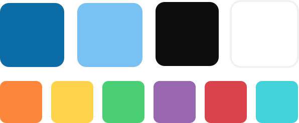
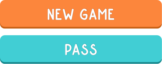
Buttons
Animation Design
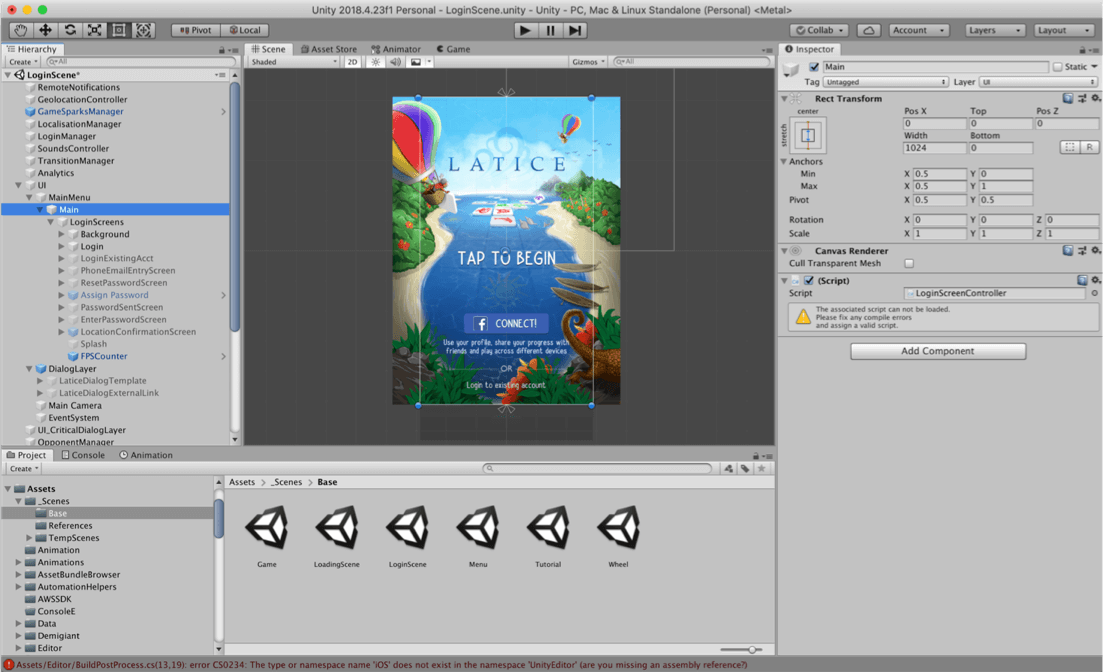
For screens with advanced interactions or animation, I created animated prototypes in After Effects. This was helpful for iterating on animation and effects ideas, and for later referencing when building the animations in Unity.
After finalizing a screen design, I always assembled the interface directly in Unity. For animations and interactions, I used a combo of plugins (like LeanTween), native Unity tools, and even a little code to bring the designs to life.
This allowed developers to focus more on wiring designs into front and backend logic and greatly optimized the handoff phase, allowing us to roll out new features quickly.
Launch, Observe, & Measure
When it came time to roll out a new app feature, we took a graduated approach for release in order to capture additional feedback and quality assurance prior to full release.
It usually went like this:
Internal team review
External review (friends, family, and dedicated external testers)
Beta test group (Latice super-fans who didn't mind suffering a few bugs)
Full release to all players
Analyze Along the Way
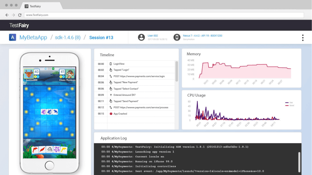
While the team monitored analytics for signals of success or failure at each step, I used TestFairy to analyze player sessions. This was really useful for whenever analytics alerted to a problem area in the app, allowing me to zero-in on the users experience in that specific area and pinpoint a cause of failure.
A/B Testing
We also validated design decisions with A/B testing, especially useful when gauging the impact of smaller design tweaks to improve conversions.
Design Iteration
Gathering feedback and improving on design didn't stop after the full release.
Although some app features were an instant hit, others required multiple rounds of iteration. Knowing when to move on is a matter of having a specific definition for success and a process for identifying friction and failure in the user experience.
Design iteration proved to be particularly crucial when it came to optimizing the onboarding/tutorial process for new players.
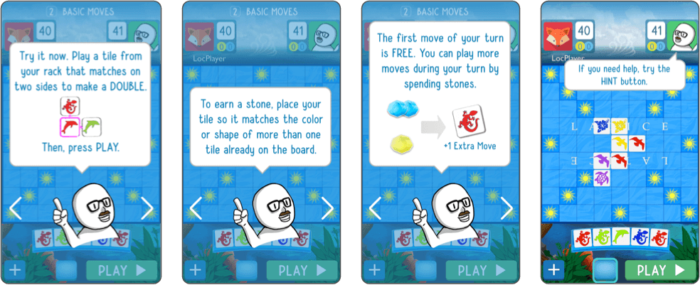
Improving the Experience (and Results)
Over numerous rounds of testing, we made key design changes to the tutorial and achieved our completion rate goal:
Added visual helpers and replaced text with icons (whenever possible)
Removed non-critical steps/screens
Provided a way for players to safely retry a step if they made a mistake
Added voiceover narration & built a story around the experience
These UX improvements eventually resulted in an 85%+ completion rate - success! 😀🎉
Growing Engagement & Retention
The Team's initial focus was centered on growing engagement and retention by creating a player base that would come back again and again over weeks, months, and years.
These are a few features I worked on, contributing visual design, user experience design, and animation.
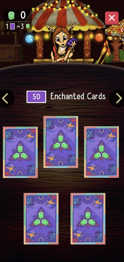
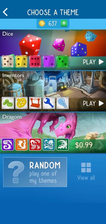
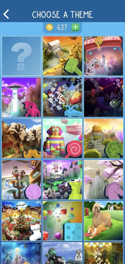
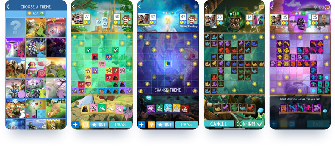
Theme Library
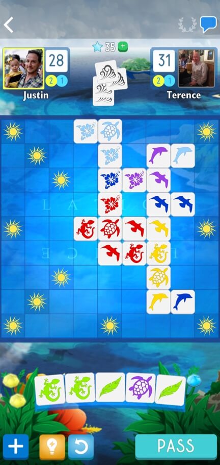
The physical game was designed with a tropical polynesian theme and we styled the game screen and tiles as such in the mobile app. However, we wanted players to have more options. Why?
Create personal connection
Bolster long-term retention rates
Offer new paths for progression by unlocking new themes
Prevent boredom by adding variety
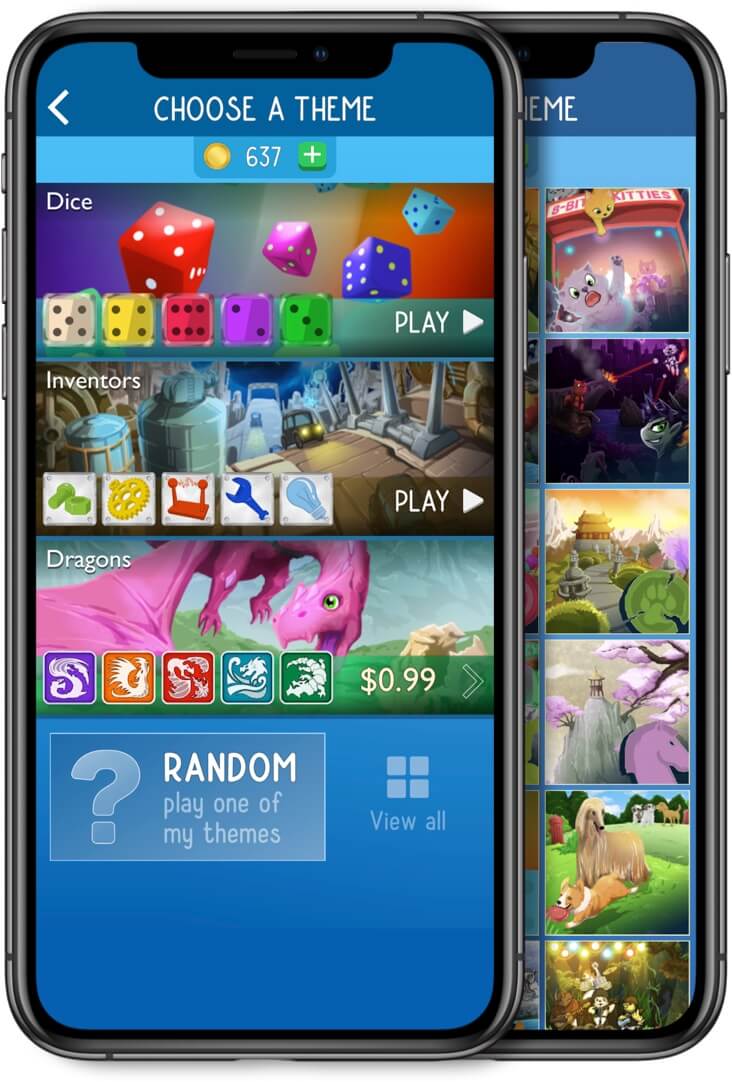
My role was to design the theme library, provide creative concepting and art direction for new themes, and collaborate on tile texture design.
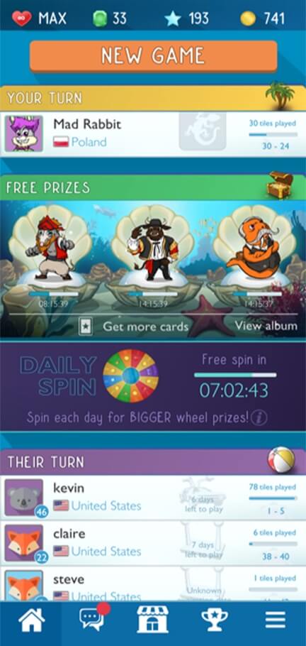
Next Game Auto-Prompt
The Latice app allows players to create multiple asynchronous games. To jump to the next game in earlier versions of the app, a player would have to:
1) Make their move on the gameplay screen,
2) Jump back to the home screen,
3) Select another game in their queue.
This was a high friction flow that led to players dropping off after committing a move.
The solution was to add an Auto-Prompt for next game as soon as a player committed a move. This kept players on the gameplay screen continuously, lifting overall engagement times within the app.
Hint Mode
In spite of improvements made to the tutorial, data and user feedback suggested that new players were still struggling to learn essential game strategies.
Hint mode addressed that issue by actually showing players an optimal way to play their tiles.
This feature improved early retention rates and helped transition new players into long term masters of Latice.
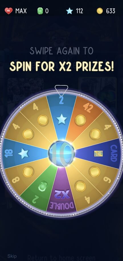
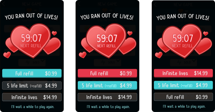
The Wheel
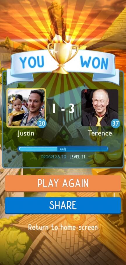
Players return when you reward them, but not all rewards are equal. Earlier versions of the game gave a simple fixed reward at the end for achieving victory. We improved on this model by using the power of a variable reward system with the Wheel.
The Wheel rewards all players with at least one spin at the end of the game. This creates a stronger mechanism for repeat engagements and more flexibility with the game economy.
I made the visual and animation designs for the Wheel in After Effects, then created all animation and particle effects in Unity.
The Results
The Latice mobile game app continues to thrive on both the App Store and Google Play Store with thousands of people downloading and playing every year. Some of the most active players have been with the app since it's intial beta launch years ago - a rare longevity for mobile game consumers these days!
MORE FEATURED PROJECTS